
Work,
in motion.
A montage of our production across sport, wellness and active hospitality.
 MovaLog the work. See the progress.2026
Brand System
(01)Context
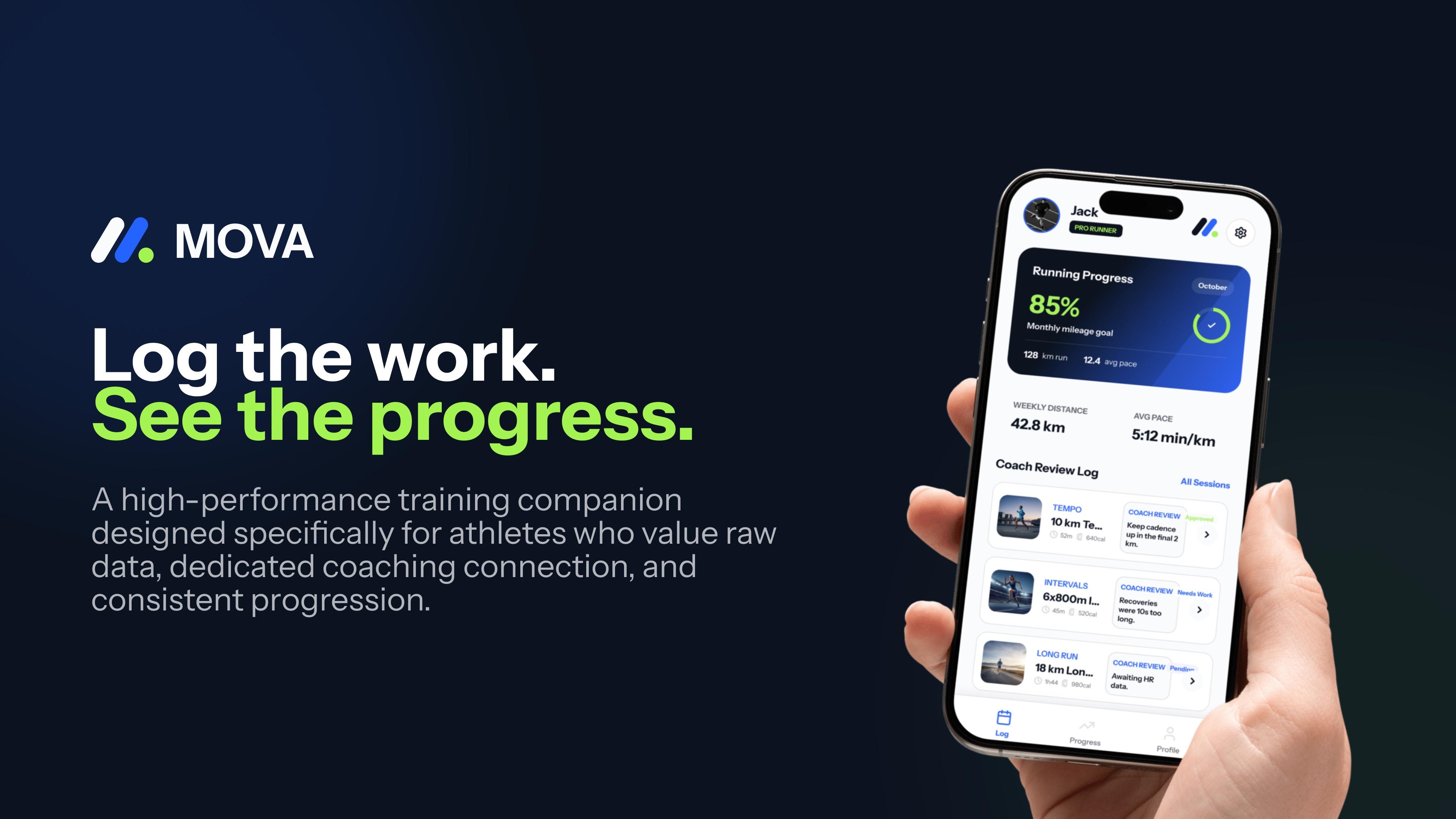
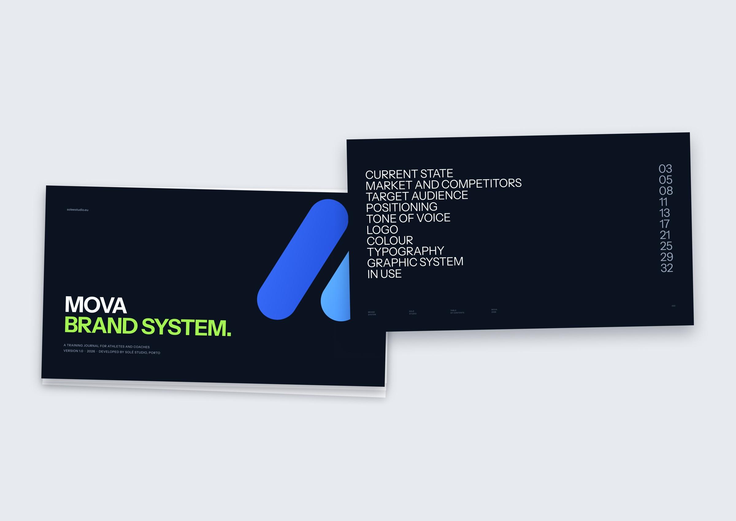
Mova is a training journal for athletes and coaches, built to track progress across sessions, seasons and years. The brief started with a logo, but we stepped back first: defining Mova’s role in training and what people trust it to hold.
(02)Direction
Research into the audience and competitive landscape pointed to a specific athlete: someone who trains with a coach, pays attention to their numbers and does not need badges, streaks or constant encouragement to stay motivated. Mova is positioned as a working record for that athlete. The motivation comes from seeing the work build over time, which allows the brand to feel focused and encouraging without becoming loud.

(03)System
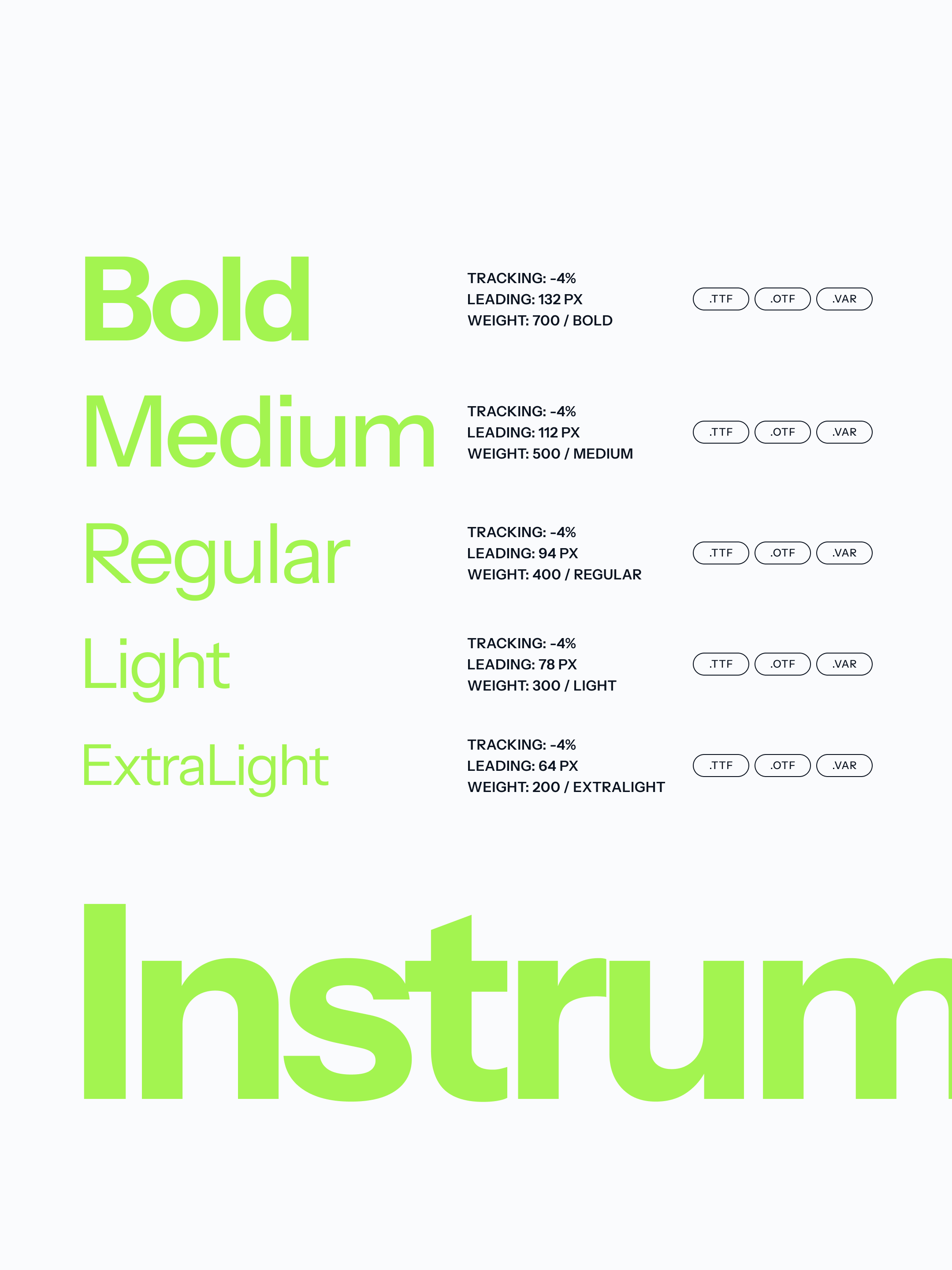
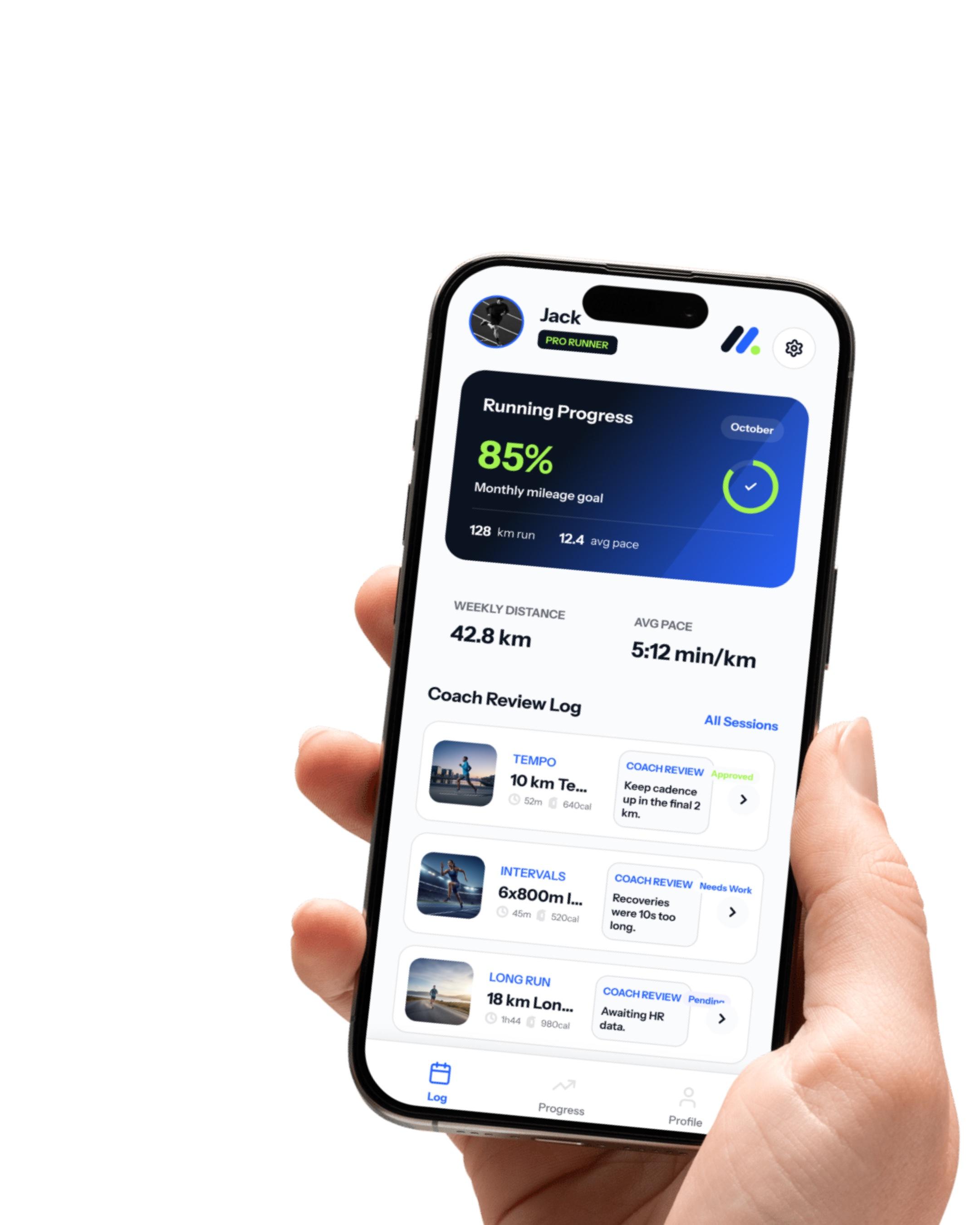
Strategy gave the identity a clear set of rules. The palette, logo, typography, tone of voice and creative direction were all designed around how the product works and what users need to understand quickly. Progress lime is the clearest example. It is used only to show progress, whether a goal has been reached or a session approved. In an interface full of numbers, that consistency lets colour communicate instantly.
(04)Outcome
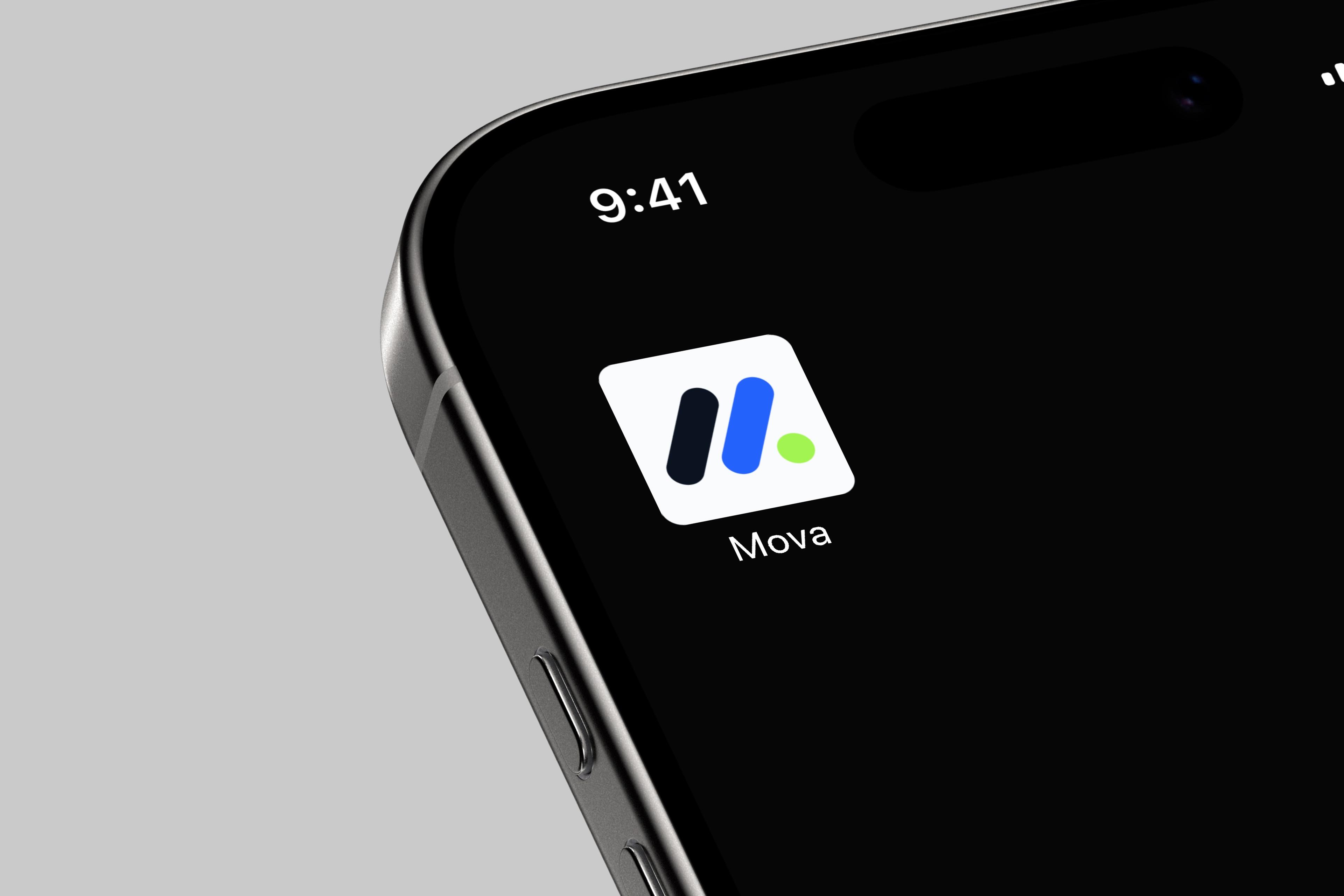
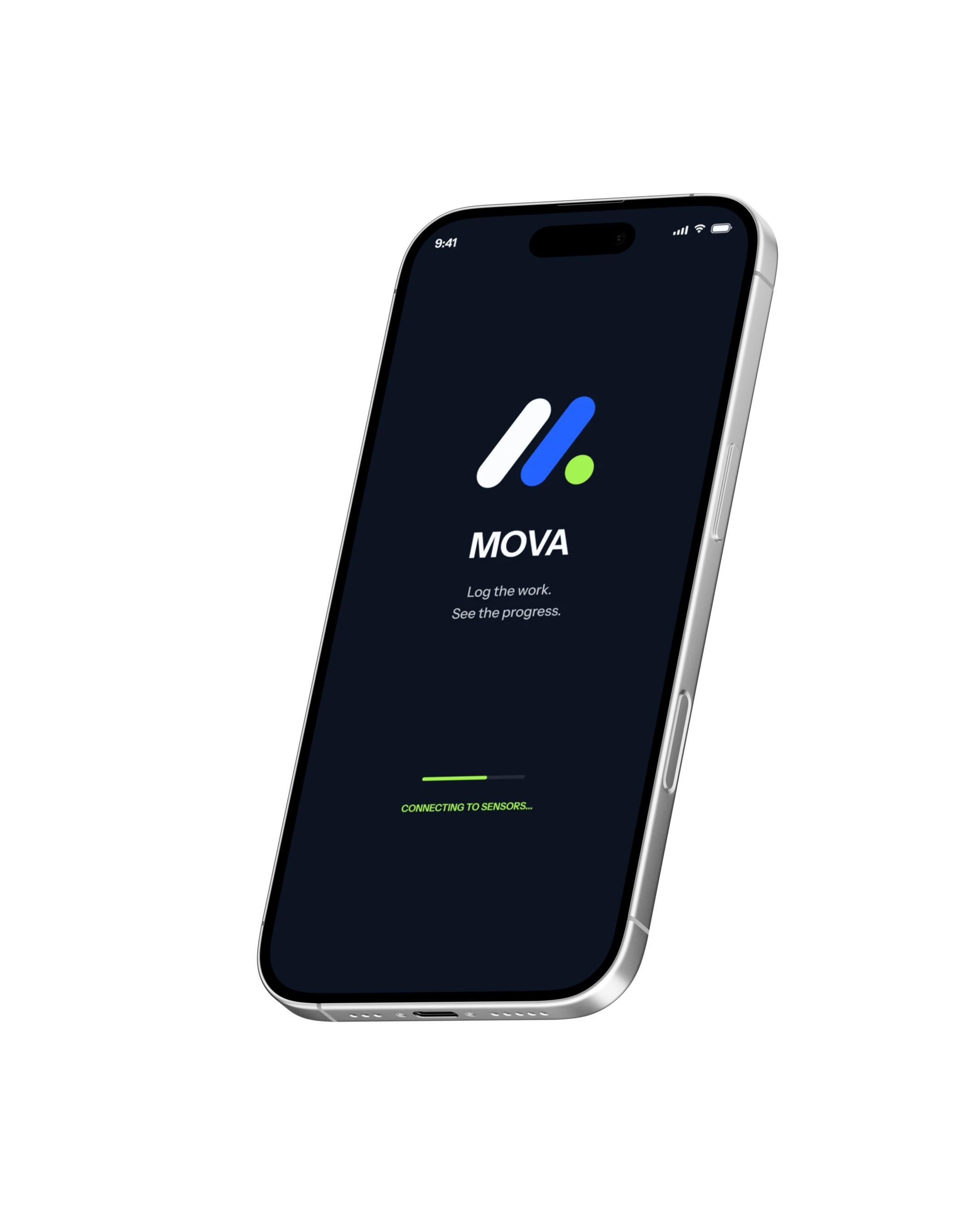
The handover covered the brand audit, positioning and audience, tone of voice and the visual identity with its motion, applied to the app icon, launch screen and interface and documented in brand guidelines.
 Semana 32One week a year, fifty-one weeks of return.2026
Brand Experience
(01)Audit
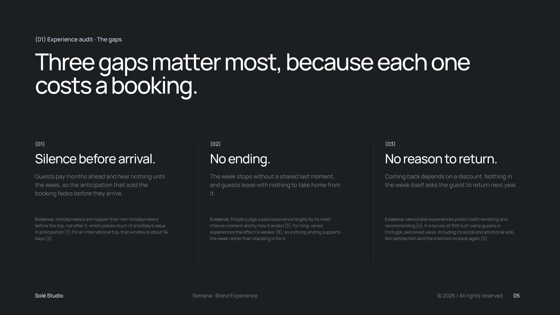
Semana 32 is a surf house that sells one week a year, week 32. We started by auditing nine moments where a typical camp holds or loses a guest. Three gaps mattered most, because each one costs a booking: silence between payment and arrival, a week that stops without an ending, and nothing in the week itself that asks the guest to come back.
(02)Journey
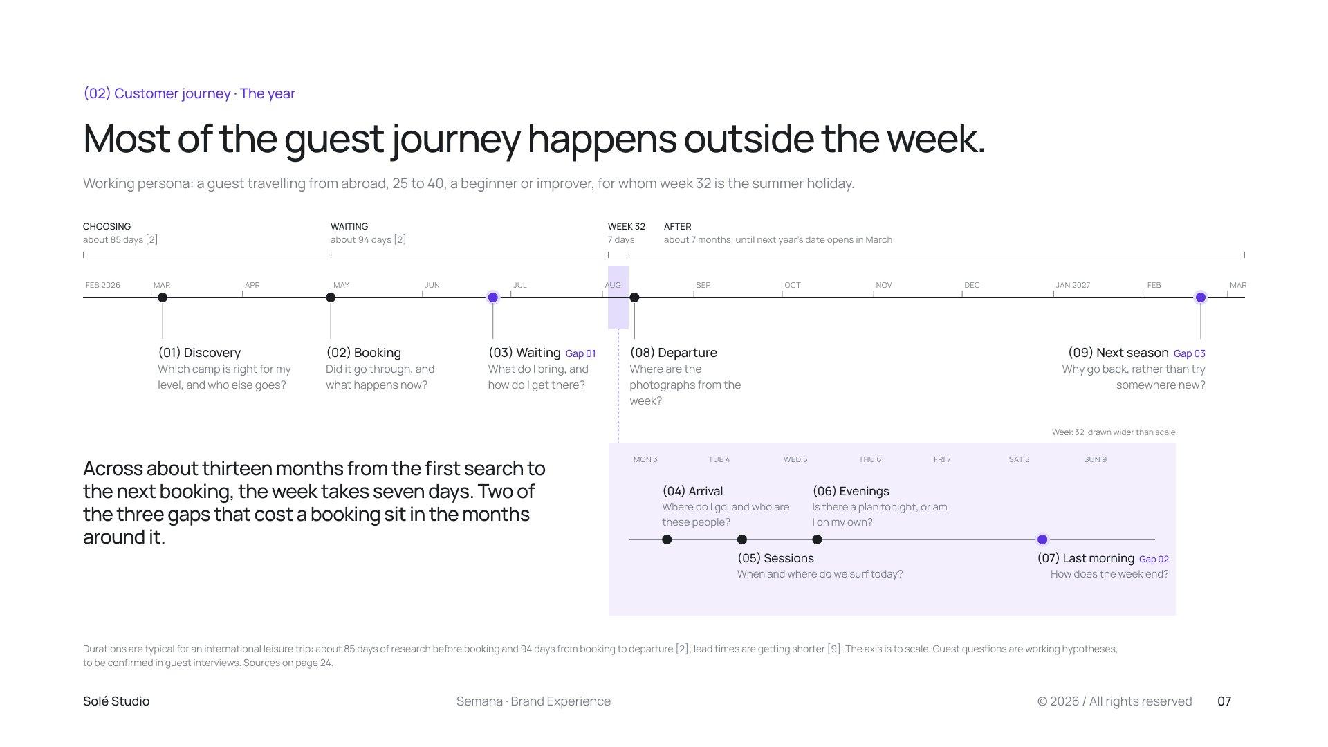
Mapped as a year, the guest journey runs about thirteen months from the first search to the next booking, and the week takes seven days of it. Two of the three gaps sit in the months around the week, so most of the experience had to be designed for the time the guest is not there yet, or no longer there.
(03)Touchpoints
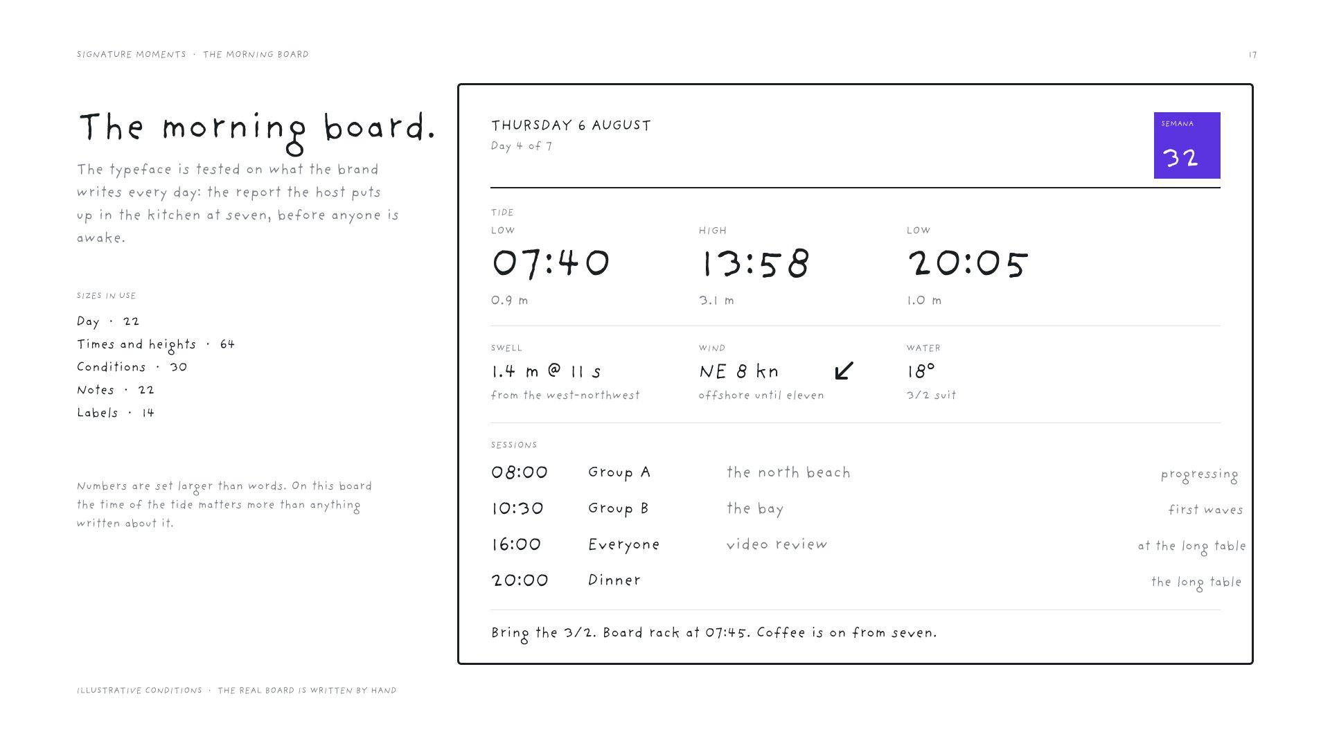
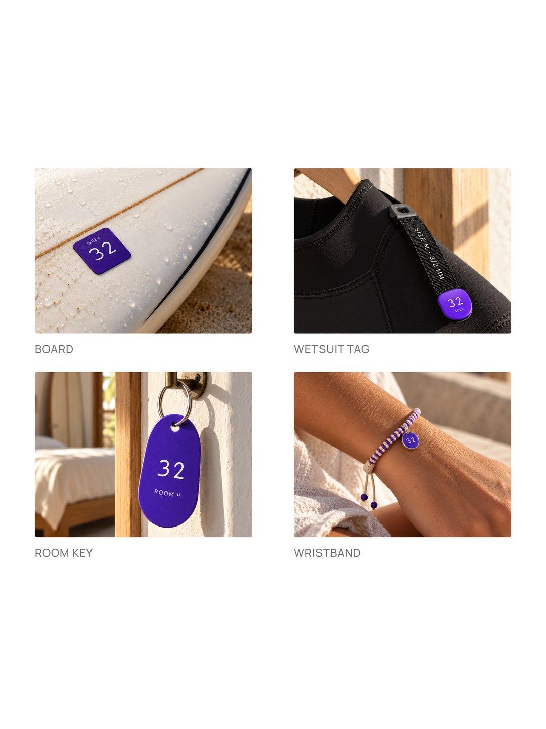
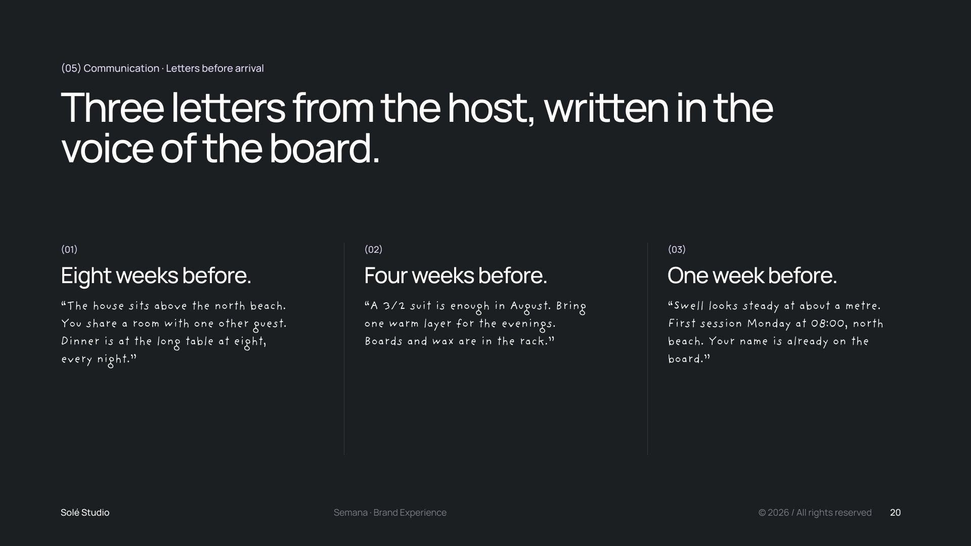
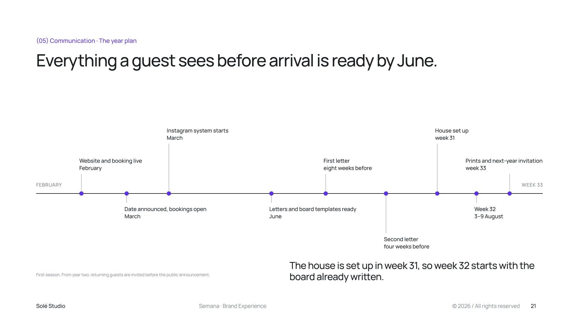
Every touchpoint follows one idea: the brand is what the host writes. The morning board, written in the kitchen before anyone is awake, carries the tides, the swell and the day's sessions, and its handwriting became the typeface and the marks. The week number goes on the things guests touch, and three letters from the host arrive eight, four and one week before arrival.
(04)Outcome
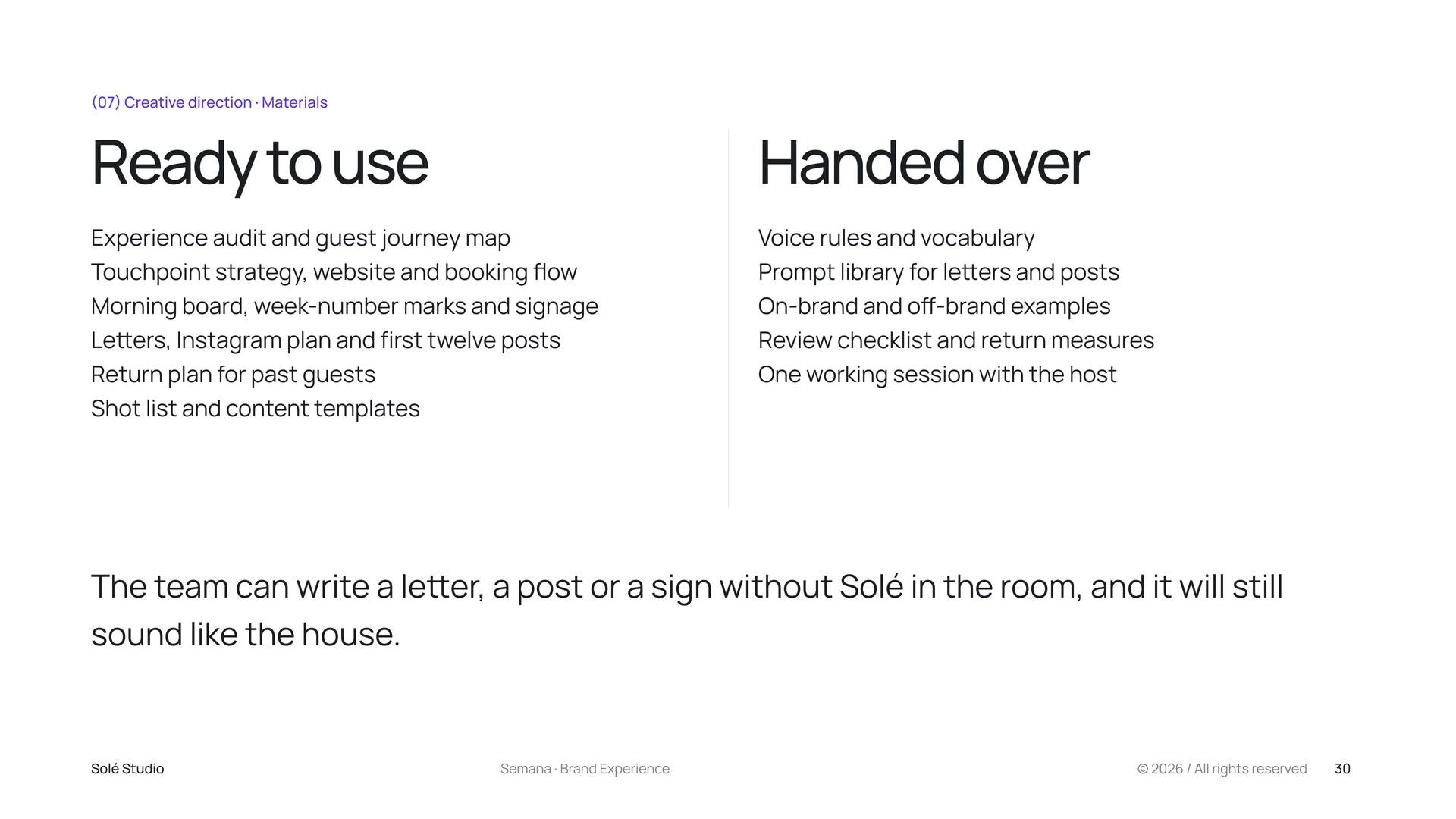
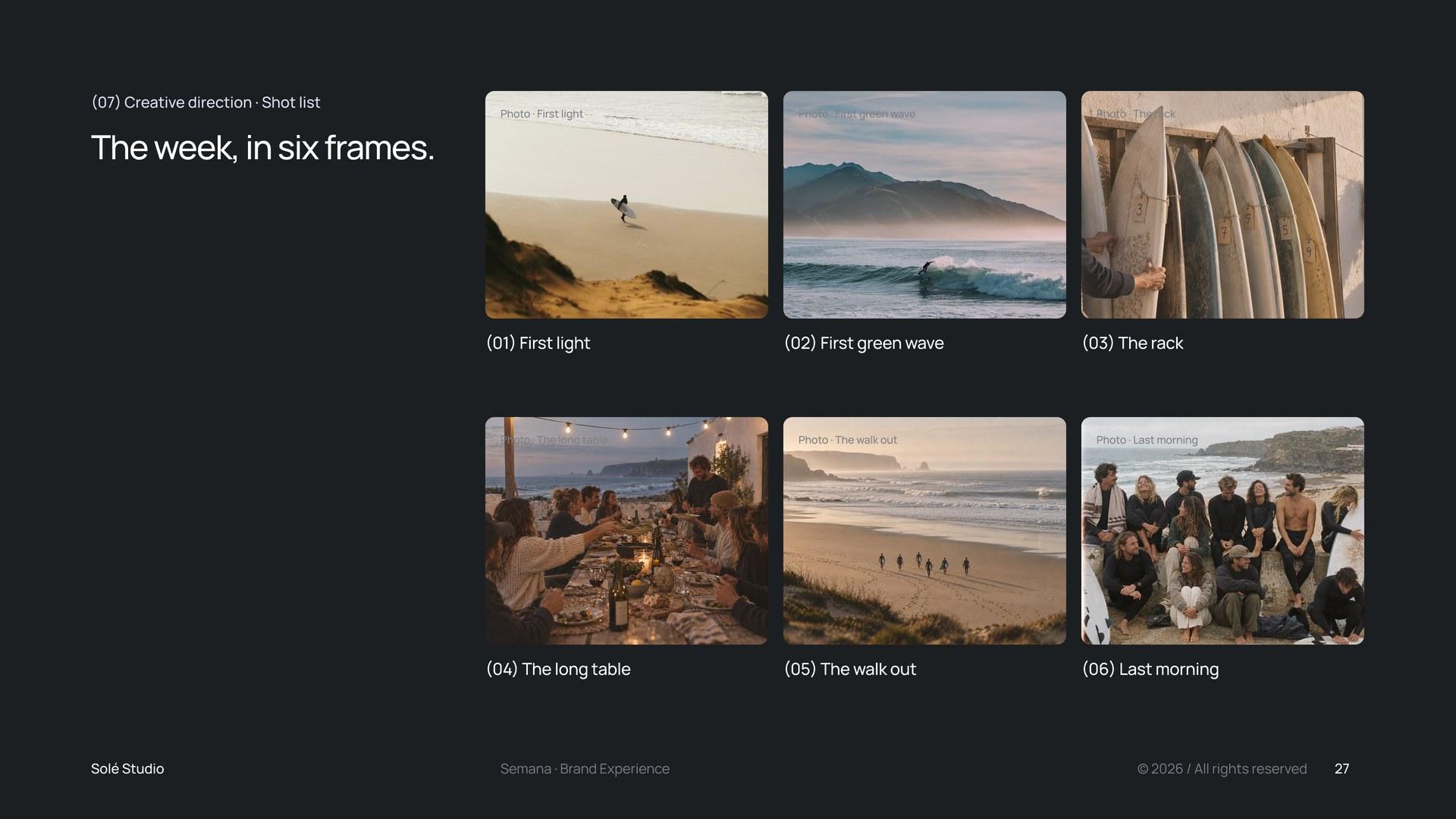
The house received the experience audit and journey map, the touchpoint strategy with the website and booking flow, the morning board, marks and signage, the letters, an Instagram plan with the first twelve posts, a return plan for past guests and a shot list. Voice rules, a prompt library and a review checklist let the team keep writing in the same voice.
Start a project
Tell us what is changing in your business. We will recommend the right starting point.


Alexandra & JamesFounders of Solé
Or write to us directlyhello@soleestudio.eu